Design For Dignity
Retail Guidelines




The mandatory requirements for access signage in retail stores are found in the BCA. They largely cover braille and tactile access signage for bathrooms, exits, hearing devices and for re-direction to more accessible facilities.
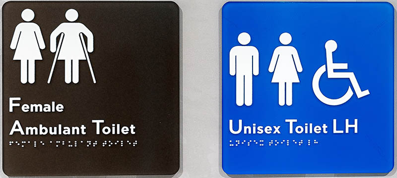
Appropriate braille and tactile signage is required for:
Beyond toilets, entrances, emergency exits and hearing augmentation, there is no other clear guidance for the accessibility of signage within stores. The combination of braille and tactile signage will increase the opportunities for people who are blind to independently navigate stores and shopping centres. Placement of braille and tactile signage in a consistent way (for example same height and colour, at entry and changes of direction and on the path of travel) will enable people to find and use it more frequently.
Written messages are everywhere in the retail environment including: product labels, marketing brochures, directional signage, terms and conditions documents, computer screens that provide customer information, advertising plinths, store signage and logos.
Here are some simple tips to help ensure that messages can be seen by more people by making them easier to see for people with low vision.
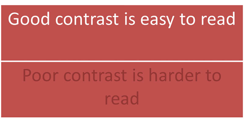
The difference between the text colour and brightness and the background on which it appears is the contrast. Having highly contrasting text and background makes your message more easily understood by people who have low vision.
You should use dark coloured text against a light background where possible. Light coloured text on a dark background can also be acceptable.
Black and white are the highest contrasting colours. Colour should not be used as the sole means for differentiating information or symbols, as people who are colour blind or have low vision may not be able to understand your message.
Opinion varies on the appropriate font size for general printed material. There are some regulations in Australia which determine minimum font sizes in advertising so that consumers are able to read them. For general printed and online material, a minimum print size of 11 point is best. Where people require “large print”, a font size of 16 point or above is best.
Australian Standard AS 1428.2 provides some guidance for the size of signage which can be applied in shopping centres and stores:
| Required Viewing Distance | Minimum Height of Letters |
|---|---|
| 2m | 6mm |
| 4m | 12mm |
| 6m | 20mm |
| 8m | 25mm |
| 12m | 40mm |
| 15m | 50mm |
| 25m | 80mm |
| 35m | 100mm |
| 40m | 130mm |
| 50m | 150mm |
Source: AS 1428.2 Table 2 Height of Letters for varying Viewing Distances
Signs should have lighting that does not produce unwanted glare or reflection. Viewing signs from different positions and levels (seated and standing) can help reveal if customers will experience issues. Ideally signs which have sufficient circulation space in front of them should be at a height that makes them easy to read for people sitting and standing.
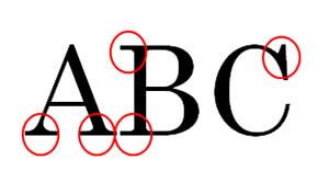
In general terms, the simpler a font, the more easily it will be read. You may read about serif fonts (e.g. Times and Century) and sans (‘without’) serif fonts (e.g. Arial and Helvetica). Serifs are the small lines that trail from the end of letters. In summary, the general opinion is that fonts without serifs like Arial are easier to read.
There are many font styles available which can be difficult to read if your audience has low vision. Quirky, fancy fonts can be fun, but there is an increasing number of customers who may not pick up the message quickly or easily.
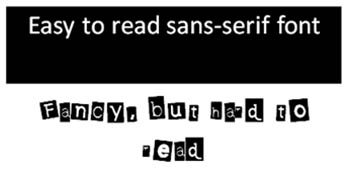
A font style is the treatment you apply to a font type. For example, you can italicise, bold, underline or CAPITALISE your font. Use these treatments sparingly. People also recognise the patterns of letters within a word and often you can recognise a word before they see all of the letters which is why motorway signs are not done all in uppercase. Fully capitalised words are also difficult for people with dyslexia and those with learning difficulties.
Khattab (2015)*Khattab, D., 2015, Rethinking the grocery store: inclusive wayfinding system for visually impaired shoppers in Grocery stores, Journal of Accessibility and Design for All, Canada tested elements within supermarket settings and found the customers with vision impairment benefited from: